The Spark
Project:The Spark
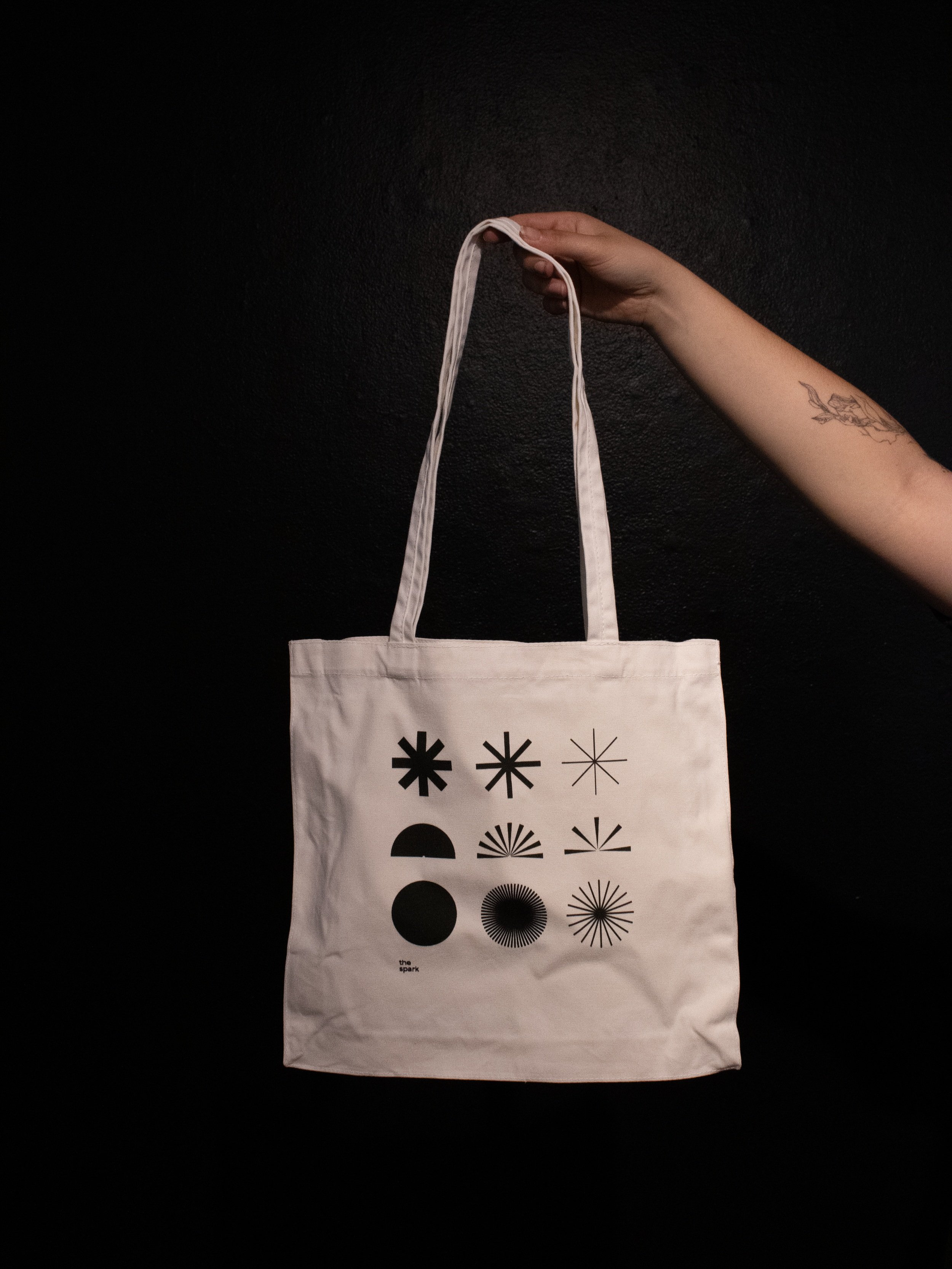
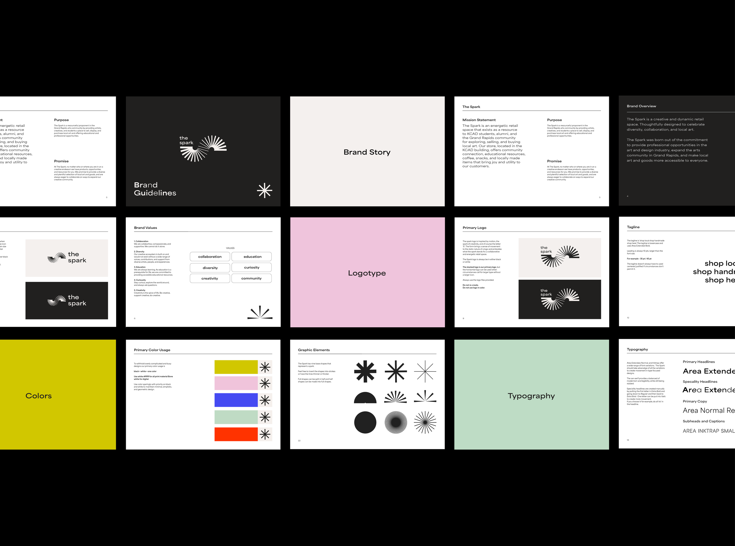
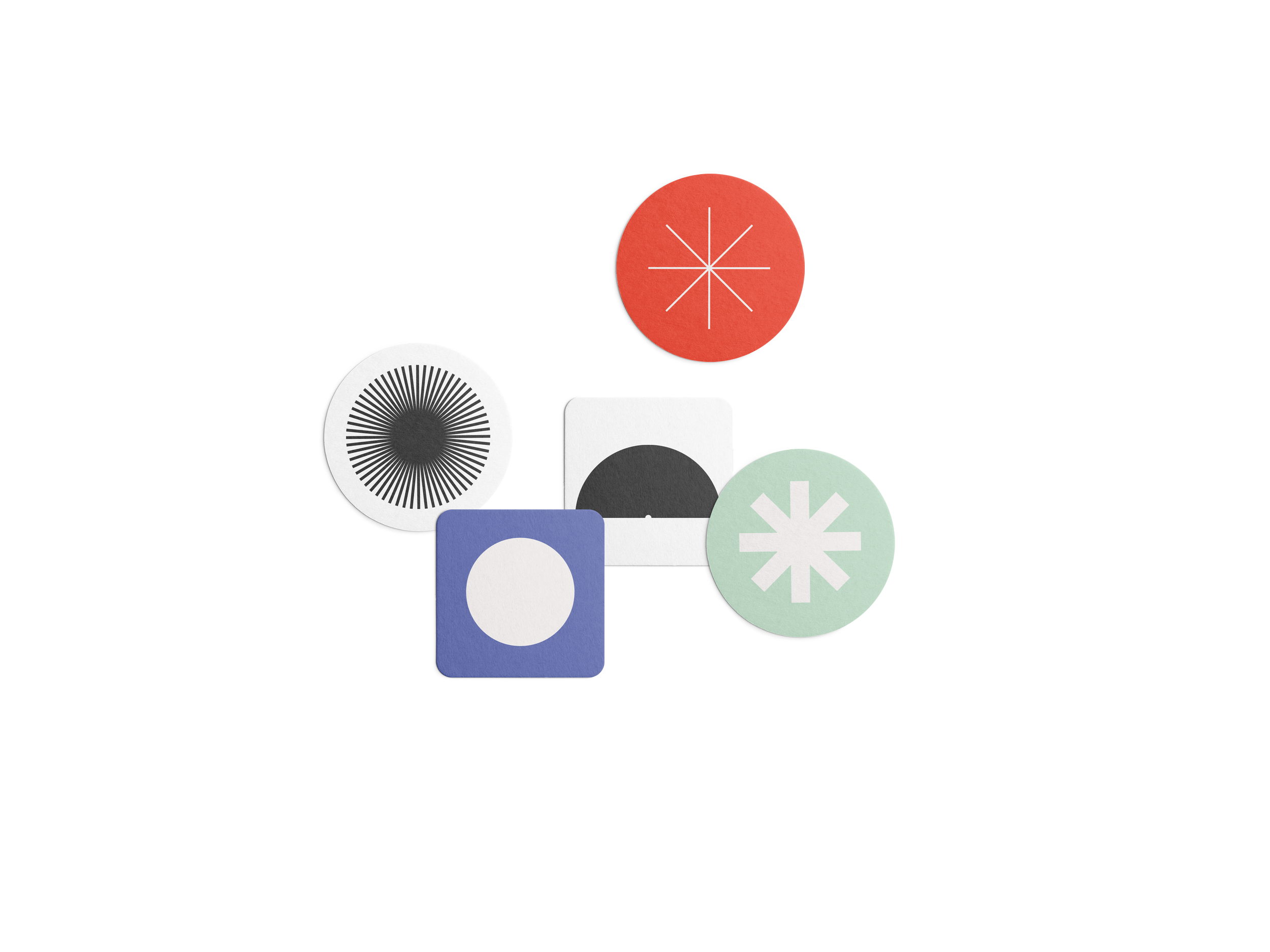
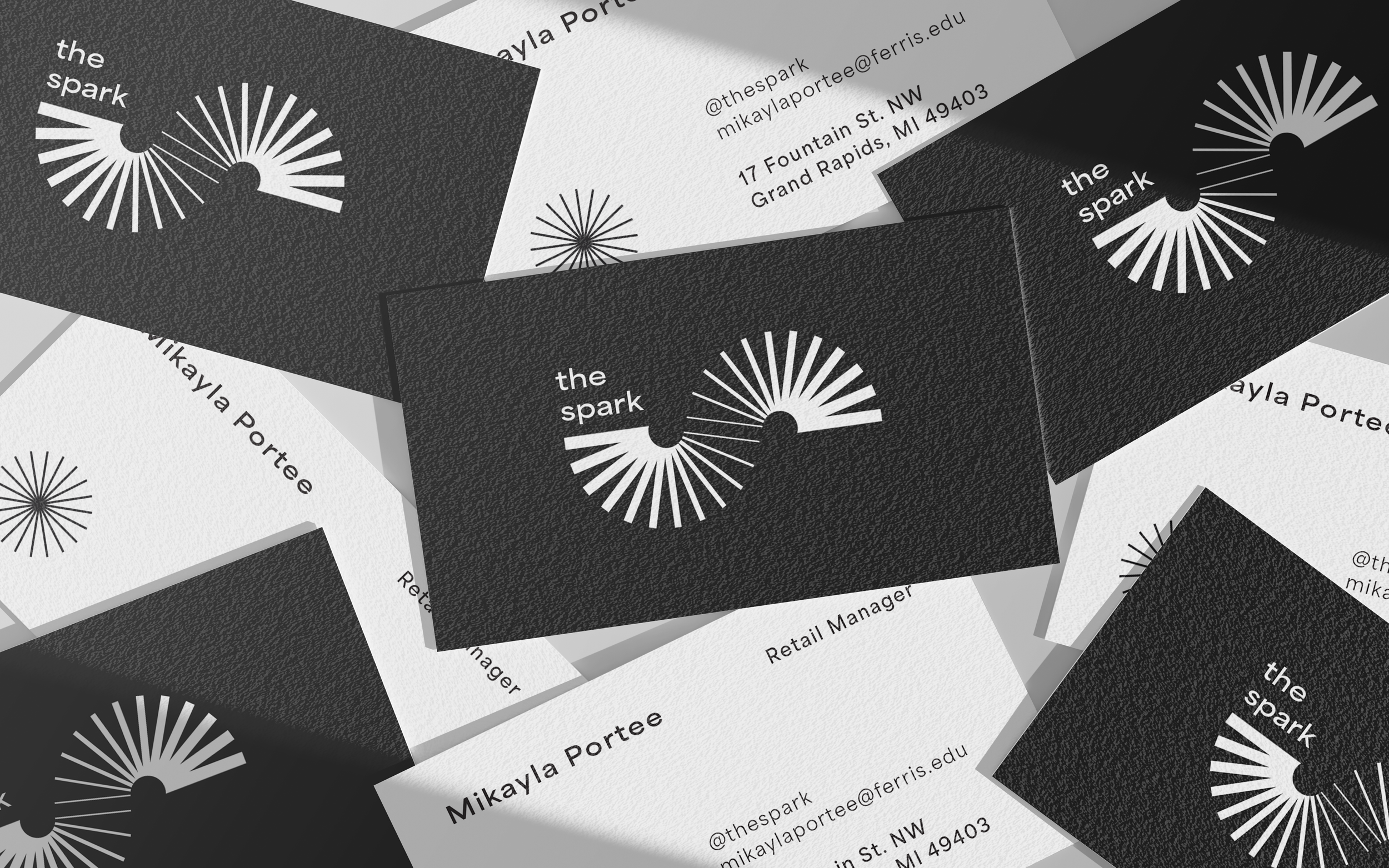
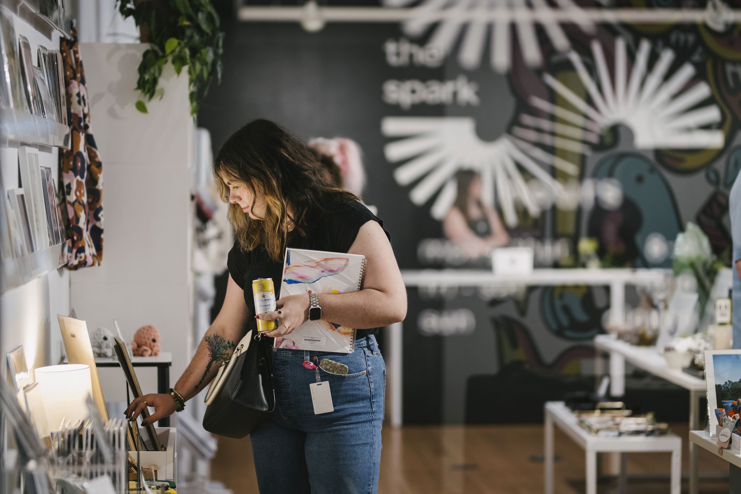
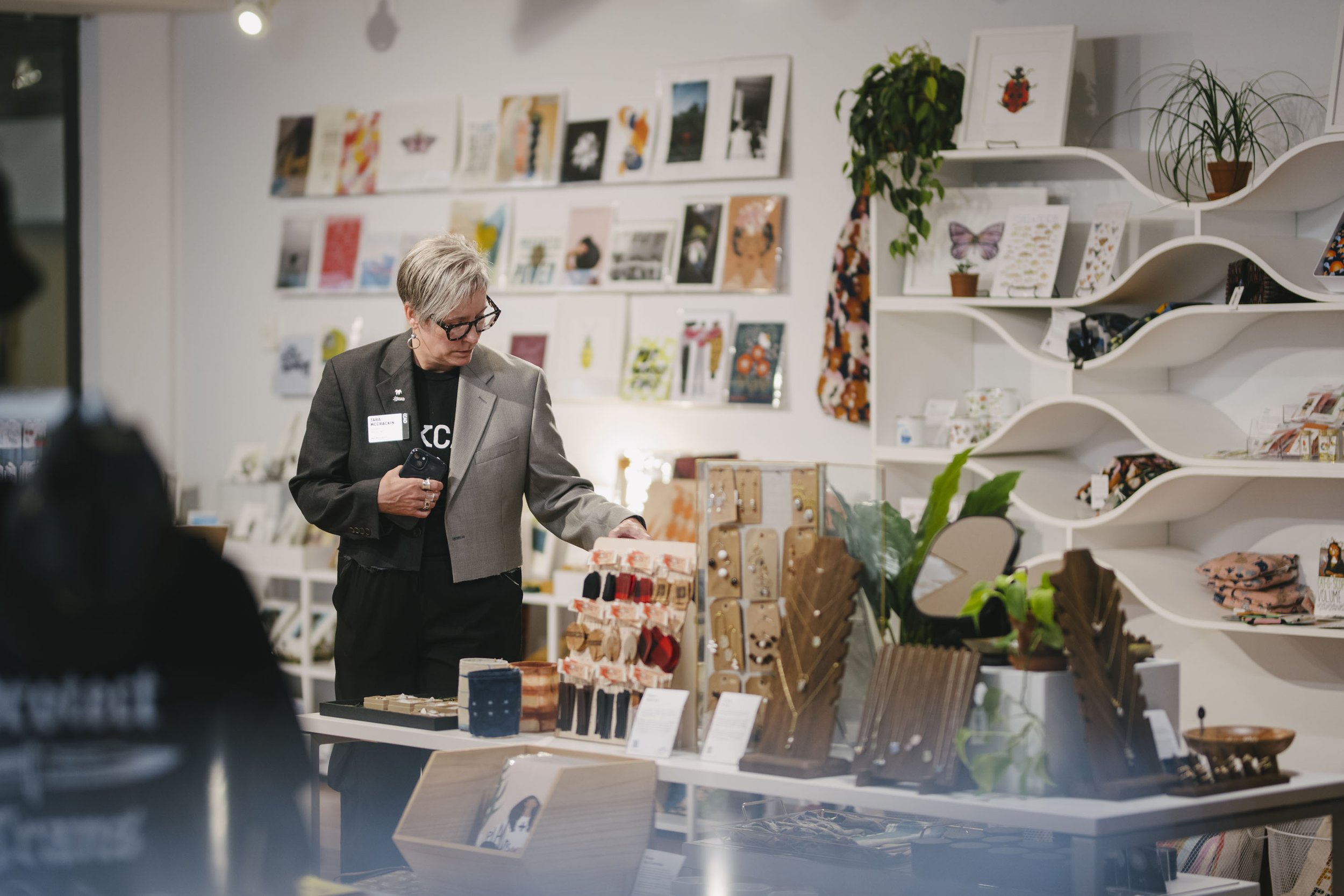
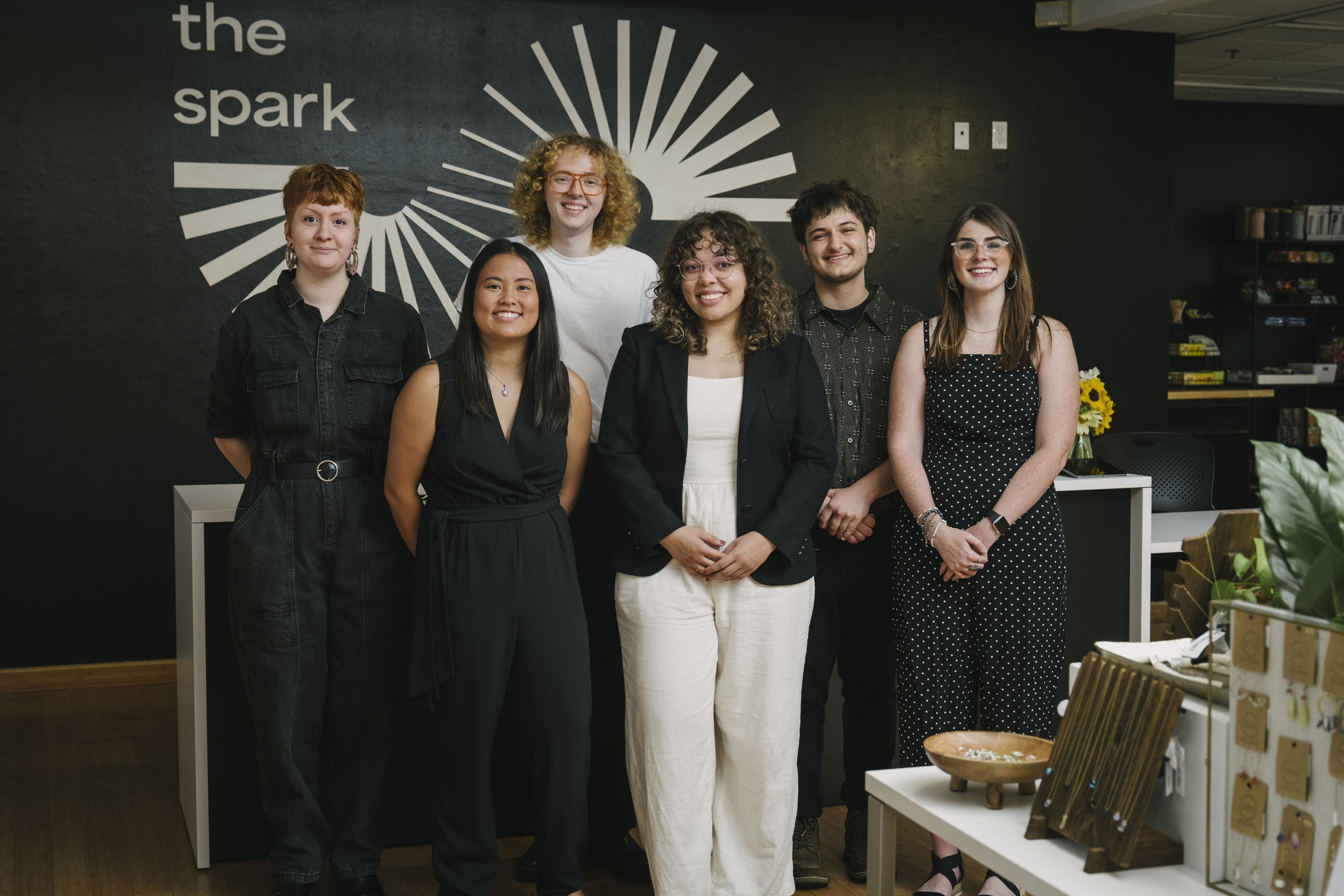
Description:The Spark is a retail space that exists as a resource to KCAD students and the Grand Rapids community for exploring, selling, and buying local art. The branding needed to be bold, dynamic, and exciting and complementary to all the products they sell. The visual identity is made up of varying converging radials to emphasize community and our connection to one another. The forms have varying line weights to show movement and energy when displayed together to emphasize their idea of sparking creativity. The visual identity is basic and prioritizes white space to allow the work displayed at The Spark to be the emphasis, while still having a strong visual language that supports their mission and values.
Scope:Brand Identity
Brand Messaging
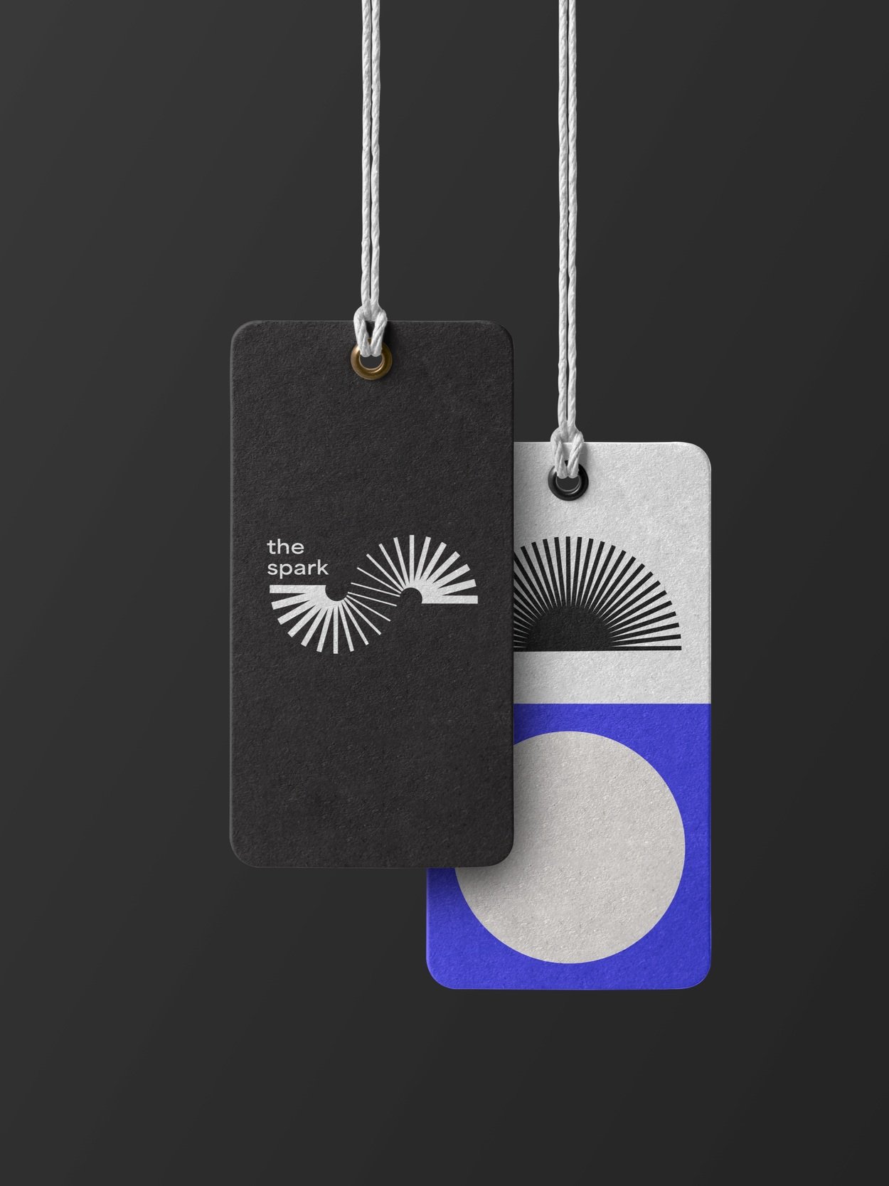
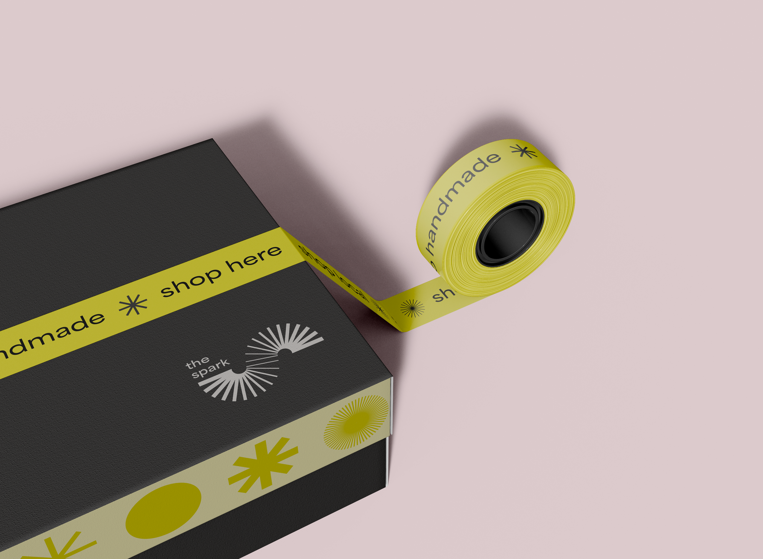
Packaging
Environmental
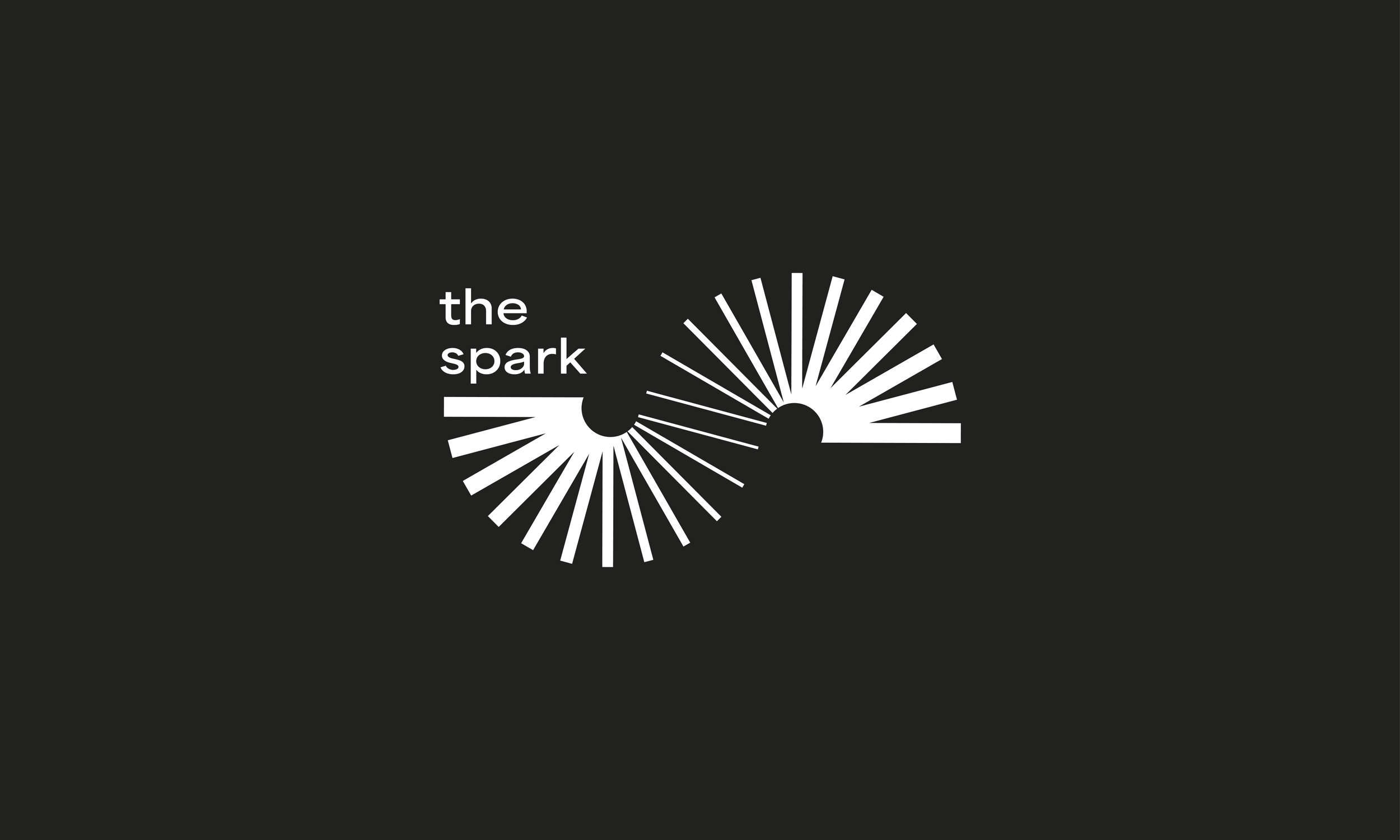
Icon & Wordmark
The spark logo is inspired by motion, the spark of creativity, and of course the letter ‘S’. The goal was to bring a sense of movement to the static nature of a logo and embodies what the spark stands for, a collaborative and energetic retail space and opportunity hub.

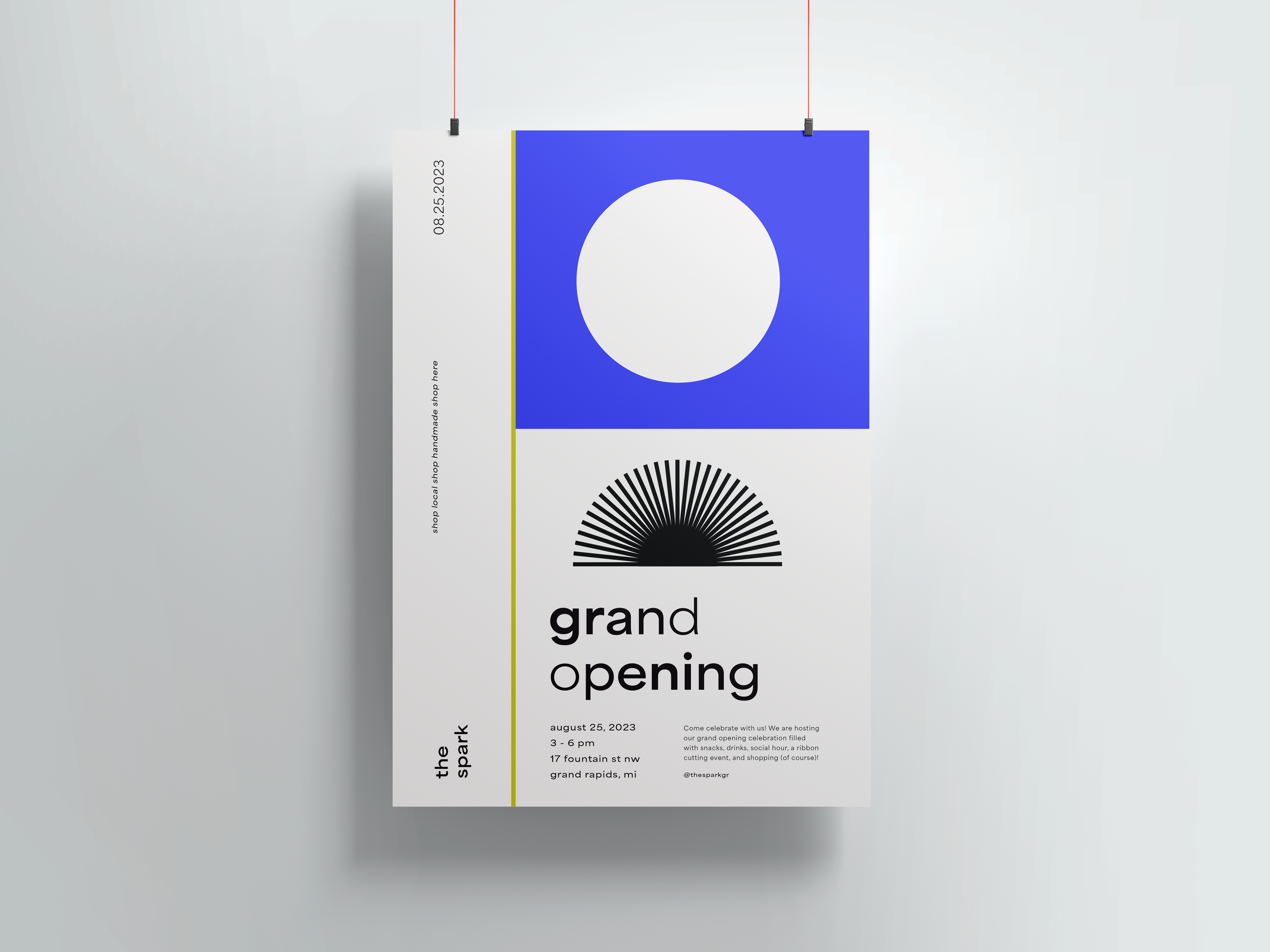
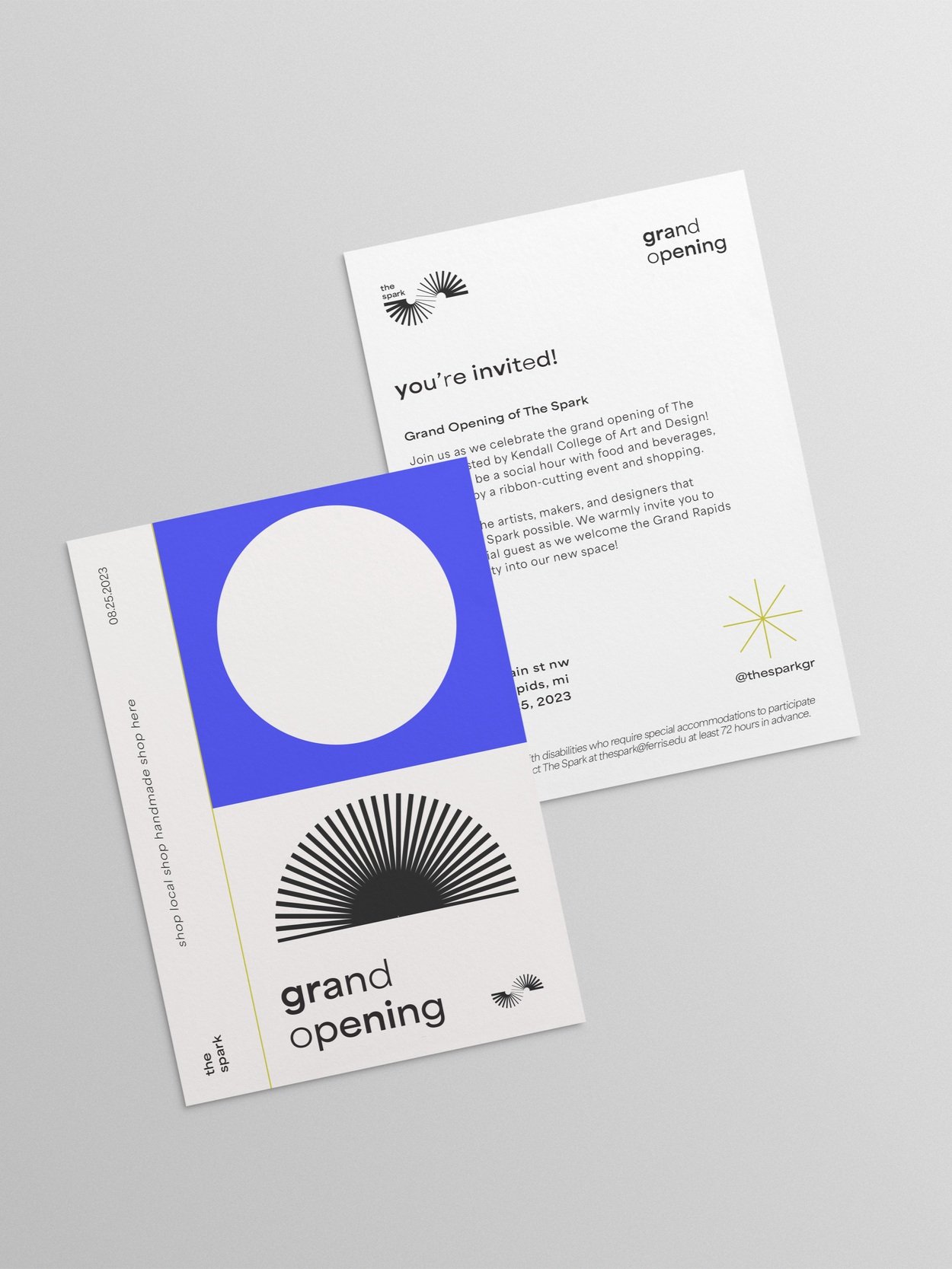
Grand Opening Campaign
The Spark hosted a grand opening party, and we needed a grand opening social media campaign to promote the event. The visual identity resembles an editorial to communicate an in-person, physically experience and uses the spark branded shapes.
Collateral:
Instagram posts + stories
Poster
Invitations

The Spark is the ignition of ideas, creativity, and represents that what sparks innovative is unique to all of us.